

Blurring a PNG can soften distracting details, create depth, or give a graphic a more atmospheric finish. The most useful approach is to blur only what needs softening, keep an editable original, and preserve transparency when the design requires it. This article explains how to choose an effect, refine transparent edges, build overlays, and avoid confusing decorative blur with secure concealment.
How do you blur a PNG without losing transparency?
To blur a PNG without losing transparency, use an editor that supports an alpha channel, apply the effect to the intended layer or selection, and export with alpha transparency intact. PNG supports partially transparent pixels, so a soft edge can fade gradually rather than ending in a hard outline. However, a PNG file is not automatically transparent; it must contain transparency information.
Before editing, decide whether you want softer details inside the subject, a softer outer silhouette, or both. Treat those as separate goals: softening a product's texture is different from making its outline fade into the background. Use a test copy to establish which result suits the layout.
For a reliable starting setup:
- Keep an untouched original. Save your working document separately from the delivery file.
- Confirm transparency exists. In GIMP, check for an Alpha entry in the Channels dialog.
- Remove unwanted backgrounds. Do not leave a visible white layer beneath an asset intended to be transparent.
- Export a test PNG. Reopen it before committing to the full design.
Match the blur technique to the visual goal
Different image blur methods produce different visual effects. Gaussian blur creates general softness, motion blur introduces directional movement, and lens blur simulates an out-of-focus camera effect. A brush-based blur tool allows localized softening instead of applying the same treatment across an entire layer.
| Technique | Useful starting application | What to inspect |
|---|---|---|
| Gaussian blur | Soft backgrounds, glows, and general diffusion | Whether important shapes remain distinct |
| Motion blur | Directional trails and energetic graphics | Whether the direction supports the composition |
| Lens blur | Photographic depth and defocused scenery | Whether the focus transition feels believable |
| Brush-based blur | Small distractions or localized adjustments | Whether the treatment looks consistent |
Use this table as a starting point rather than a rulebook. For a promotional graphic, try Gaussian blur on background decoration while leaving the product and headline sharp. For a movement-led composition, test motion blur on a duplicate rather than immediately altering the main subject. These are applications of the different effects, not interchangeable treatments.
Avoid choosing a setting solely because the preview looks dramatic. Compare the softened version with the original and ask what the effect contributes: clearer hierarchy, a quieter background, or a deliberate sense of movement.
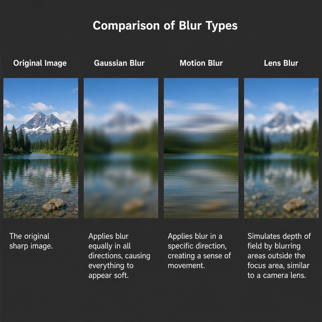 Open larger image in a new tab
Build the effect with an editable workflow
A duplicate layer or an editable filter gives you room to revise the result. Adobe recommends applying blur to a Smart Object or duplicate layer for flexibility, and its Smart Filter workflow allows settings to be reopened later. Keep that editable document as your master instead of relying on the exported graphic for future changes.
Use this sequence when you need to blur image details without softening everything:
- Identify the target. Decide whether you are treating the background, a small object, or an entire graphic.
- Duplicate the relevant layer. Keep a clean reference available for comparison.
- Select the intended area. Check that nearby text, borders, and product edges are outside it.
- Apply a modest blur. Increase the amount gradually while watching the preview.
- Review the boundary. Look for abrupt transitions or unwanted color spreading near the selection.
- Compare at delivery size. Keep the version that supports the composition rather than the strongest effect.
In GIMP, Gaussian Blur is available under Filters → Blur → Gaussian Blur. Its horizontal and vertical controls can be linked for even softening or adjusted independently for unequal diffusion. Increasing the values produces a stronger effect, so judge the preview instead of copying settings from an unrelated image.
For repeatable work, record the image dimensions, chosen filter, and settings alongside the editable file. Treat those notes as a starting recipe for similar assets, then review each result individually.
Refine transparent edges before exporting
A transparent blur depends on more than lowering opacity. Alpha transparency controls how strongly each pixel contributes when the PNG is placed over a background; partially transparent edge pixels create the gradual transition. That makes the final background part of your quality check, not an afterthought.
Place temporary light, dark, and saturated backgrounds beneath your working asset. Inspect the silhouette for an unexpected fringe, a rectangular boundary, or a fade that feels too broad. Then remove those test backgrounds before exporting the transparent version.
If the outline should stay crisp, avoid treating the whole silhouette simply to soften an interior detail. Try selecting the interior region instead, then inspect the boundary carefully: GIMP's documentation notes that colors from outside a selection can influence the blurred area.
Do not approve the asset only against an editor's checkerboard. Preview it in the actual composition, especially when the design places pale objects over dark backgrounds or uses a very subtle glow.
What can a transparent blur overlay actually do?
A transparent blur overlay can add a soft glow, haze, or diffused shape, but an ordinary PNG cannot dynamically blur whatever appears behind it. PNG supplies foreground pixel and transparency information, not a live background-processing instruction. For an interactive frosted-glass effect on a website, CSS backdrop-filter is the relevant mechanism because it applies effects to the area behind an element.
Choose between two approaches:
- Reusable decorative asset: Create a colored shape on a transparent layer, soften it, and export it as a PNG. Use it as atmosphere rather than as a promise of background distortion.
- Background-specific effect: Work from the actual background image, blur the intended region, and keep it aligned within that composition.
For the decorative option, GIMP's transparency documentation demonstrates a soft glow surrounding an object on a transparent background. The background-specific option follows a different principle: blur the underlying image content, rather than expecting transparency alone to change it.
When assembling a blur PNG asset library, label decorative overlays clearly. Names such as “blue soft glow” are more useful than “universal background blur,” which implies behavior the file does not provide.
Separate decorative text and face effects from privacy
A blur text PNG can work as a stylistic asset: think softened background lettering or a dreamy title treatment. For that purpose, experiment with a blurred duplicate behind readable foreground text. Keep the effect subordinate to the message, and test the smallest intended placement before approving it.
A censored blur PNG or face blur PNG serves a different purpose when it is intended to conceal information. Reduced sharpness is not a guarantee of anonymity or unreadability. Digital-evidence guidance warns that blurred material can retain identifying information, while research presentations describe how blurred characters can remain distinguishable.
For sensitive material, prefer complete removal or opaque replacement of the relevant pixels in a separate sharing copy. Do not substitute a translucent decorative overlay for redaction. Inspect the exported result carefully, and do not share the editable source containing the original information.
Keep the approval criteria separate: decorative blur should look right; concealment must address what information remains available.
Finish with an export check
Keep the editable master, then export a separate delivery PNG with transparency preserved where needed. In GIMP, alpha transparency requires an alpha channel; its export workflow supports producing a PNG with transparent regions. Reopen that file rather than assuming the working preview and delivered asset are identical.
Before publishing, check:
- The intended subject and essential text remain clear.
- Soft edges look deliberate against the destination background.
- Decorative overlays are correctly positioned and named.
- The exported file contains no unwanted background layer.
- Sensitive information has been handled separately from cosmetic effects.
Effective PNG blurring starts with a specific purpose. Choose the technique that serves that purpose, make restrained adjustments, and judge the exported asset in its real setting, not just inside the editor.


